
The Power of Relative Moves or Correlation by D.R. Barton, Jr.
One of the key thoughts that institutional money managers keep in the front of their minds is the diversity of a given portfolio.
We could dig into modern portfolio theory and other academic claptrap here, but let’s just cut right to the chase — a diversified portfolio essentially means that all the elements of the portfolio don’t go down at the same time. So if the stock market has a 15% sell-off, a portfolio manager doesn’t want the whole portfolio to drop 15%. To make this happen, you need to find assets that don’t move in the same way. The mathematical term we use for measuring how similarly different instruments act is correlation.
Two things are correlated if they move in the same direction at the same time. This is the case most of the time for the S&P 500 index and the Nasdaq index. Both tend to move up or down at the same time though one index might move more in a direction for any given timeframe. Here’s a somewhat busy chart that measures the correlation of two instruments (don’t worry — there are explanatory notes for each point below):
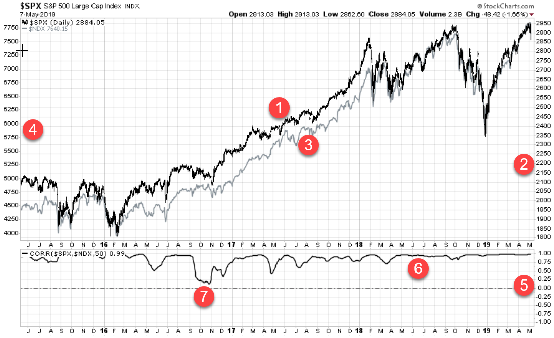
Notes for Red Circles above:
1 & 2: The dark line is the S&P 500 index and #2 shows its scale on the right sides of the chart.
3 & 4: The grey line is the Nasdaq index and the #4 shows that its scale on the left side of the chart.
5: This is the scale for the correlation coefficient between the S&P 500 and the Nasdaq. The scale runs from the highest level of 1.00, which would mean perfect correlation or that the two instruments move in the same direction. A reading of -1.00 is a perfect inverse correlation, meaning that the two instruments move in the opposite direction of each other. A reading of 0 means non-correlated or that the two have no relationship to each other.
6: You can see that the S&P 500 index and the Nasdaq are highly correlated. This chart shows correlation for the movements of the past 50 trading days (about 2 ½ months). And the correlation between the two is in the high 90s (currently at 0.99).
7: Periods of lower correlation do happen, like in the fall of 2016 when mega tech stocks like Facebook (FB), Amazon (AMZN), and Alphabet/Google (GOOGL) swooned while the S&P 500 held steady. But you can see almost all periods have a very high correlation.
So having both an S&P 500 ETF and a Nasdaq ETF in your portfolio would give very little diversification.
What would offer some diversification (or non-correlation) to a portfolio of U.S. stocks? The classic answer is U.S. Treasury bonds. Let’s see how that looks on our chart:
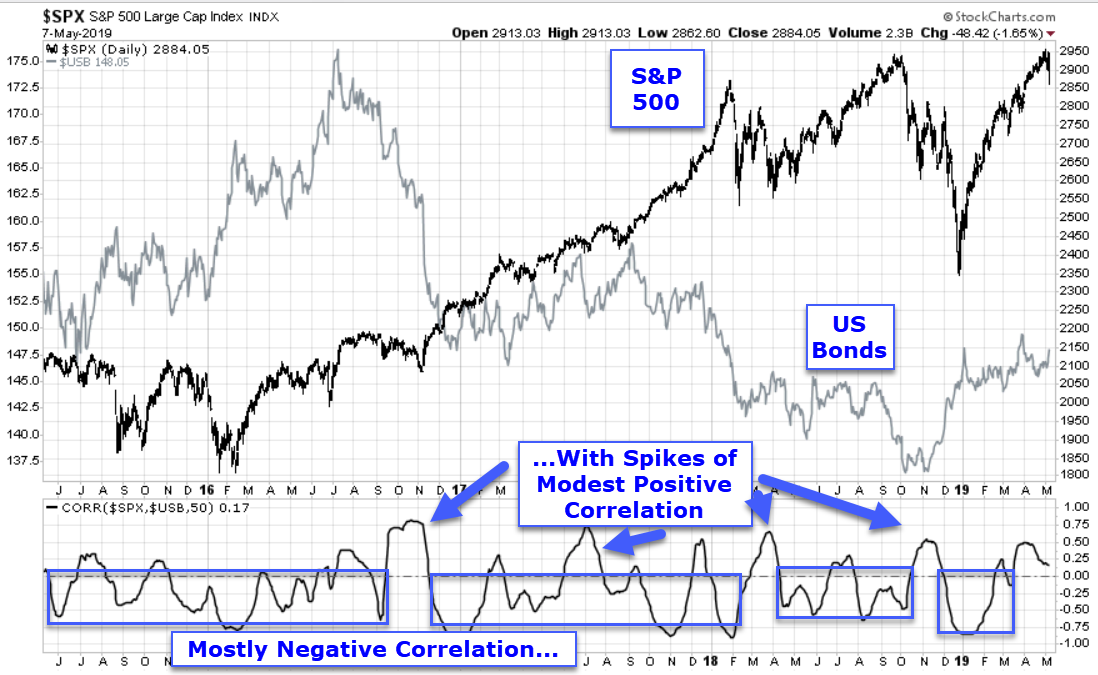
Here we can see that most of the action stays with an inverse or negative correlation (they move in opposite directions) with brief periods of correlated moves. In particular, look at how inversely correlated the two became during the big drop at the end of last year.
Now that we have a useful tool for measuring how assets move relative to one another, we’ll look in a future article at how cryptocurrencies (think Bitcoin, Ethereum, etc.) move in relation to other assets. Spoiler alert – the upcoming mathematical analysis shows why I think cryptocurrencies are becoming a whole new asset class. So stay tuned…
Great Trading and God bless you,
D. R.