
Facts are stubborn, but statistics are more pliable.”
Mark Twain
***A Note to start: If you’ve ever wondered about the validity of the old saying that you need 30 data points for statistical significance, this article is for you . . . even if you don’t care about the U.S. Presidential cycle. And thanks for the very useful and thought provoking comments so many of you sent in last week. Keep them coming!
After two years of working for DuPont, I followed up on one of my earlier goals – to get my MBA. When I was accepted into a full-on program (not one of those weekend pocket MBAs), I also received a letter stating that I would need to take a prerequisite statistics course before starting my core classes. I was rather annoyed since I already had a B.S. in chemical engineering. In the process of completing those rigorous requirements for my major, I found myself only three courses shy of a minor in mathematics. When I brought this up with the dean of the MBA school, he rigidly stuck to the letter of the law — since I hadn’t taken a pure statistics course in college, he insisted that I take the prerequisite.
So the summer before my MBA program started, I dutifully showed up for my first Statistics 505 class and I kid you not, we spent the whole day on the intersections and unions of sets. At the end of class, I informed the professor that I would not be returning. I went home, grabbed one of my engineering textbooks, marched back to the dean’s office and flipped the book open to one of the chapters on statistical thermodynamics. I opined to the dean that, “If I passed this course, I don’t think I’ll slow down any of your MBA courses with my lack of statistics background”. He begrudgingly signed my prerequisite waiver.
In the following 15 years at DuPont, I worked with some world-class statisticians on various production quality issues. Every time I talked with one of them, I was amazed at how this very useful field is mired in terminology and minutiae that causes us more practically minded folk to pull our hair out! Getting a simple answer from a statistician was a bit like trying to take a sip out of a fire hose.
So, it is with a somewhat jaded statistical background that I arrive with this week’s “burr under my saddle”. In doing my literature review seasonal patterns for last week’s article, I came upon and referenced an article that supposedly debunked the presidential election stock market cycle. The entire basis for the author’s argument was that there are only 27 data points and not the 30 required by “statistical rule” – and therefore, the author concluded that the presidential election cycle, using his exact quote, “is absolute rubbish”. I am amazed at how many people have read this “in-depth analysis”. Forbes.com even picked up the story and published it in their personal finance section!
For some reason, that ill-considered conclusion rattled around in my head all last week. Like a small pebble in my shoe, it was irritating just enough to make me stop what I was doing at one point and take care of it. And you, my beleaguered readers, are the beneficiary of my anguish. Because in my research I found a cool visual way to look at statistical significance and sample size that I think you might find useful as well. Let’s dig in.
Presidential Market Cycle – How many data points do you need?
For a reminder about the presidential election / stock market cycle you might want to read last week’s article so we don’t have to go back over that material.
The real issue before us is whether the presidential election cycle is statistically valid. Saying that a group of 27 data points is bad and that 30 would be good just doesn’t cut it for me. We know from last week’s article that one peer reviewed article ran the statistical validity numbers and found that even the smaller sample of post-WWII results was valid. And for those of you who really want to “geek out” on presidential election stock cycles, here’s another peer reviewed article that validates the phenomenon with some rather unique tools. You can check out the paper by Nickles and Granados at Pepperdine University’s Graziadio School of Business journal here.
Interestingly, the more I have dug into this seasonal cycle the more support I find for it! But I do want to show you a cool visual way to test if a sample size is sufficient. Jed Campbell’s excellent website suggested this visual observation and provided the spreadsheet to draw the graphs below. But before we get to the charts, the answer is, “Yes, I did enter all the Yale Hirsch data!” All this for you, dear reader and for my quest for personal clarity about sample size for statistical significance. And, oh yeah, to rebut that asinine article’s conclusion and get the metaphorical “pebble out of my shoe”. Now back to our regularly scheduled article…
In short, sufficient sample size is the point where the standard deviation for the sample and the confidence intervals around the standard deviation stop jumping around – they settle down to a smooth reading. If that statement makes your head spin a little, just keep reading! I said this would be visual, so the show and tell portion of the article is just below.
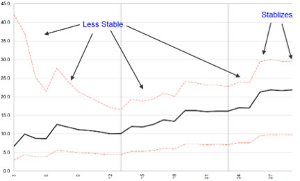
The middle black line in the chart below displays the standard deviation of market returns on the x axis for year 3 of the presidential cycle. This is the “pre-election year” and it has been the best year of the cycle for markets. The chart shows all 44 presidential cycles dating back to 1833 along the y axis. As you can imagine, the variability among only a few data points would be pretty large – and you can easily see that on the chart. Look at the great width of the upper limit (upper hashed red line) and the lower limit (lower hashed red line) – for the first 6 samples. As the sample size becomes larger (moving toward “sufficient”), the upper and lower confidence limits start to converge and then they stabilize along with the standard deviation line:
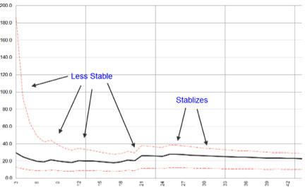
You probably noticed that this data series started to reach stability somewhere between 25 and 28 data points. Statisticians see this same phenomenon across a wide variety of data sets – which has led to the rule of thumb about 30 data points needed. This chart is important for us as we approach the third year of the cycle. For the sake of completeness, let’s look at the chart of standard deviation and confidence limits for the other years in the election cycle.
Here is the standard deviation for returns in the post-election year, the first year in the cycle and the one which Hirsch found to have the worst performance:
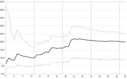
You can see that the post-election year remains unstable for more elections. This culminates in the big jump in standard deviation at data point 26 – when the market had a whopping 66.7% up year during FDR’s first year in office – 1933. Compare that plot to the results for the second year of the cycle dubbed the mid-term year:
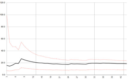
Here, we notice that the data set is much smoother with fewer bumps and a quicker confluence of the confidence limits.
Lastly we have year 4 or election year:
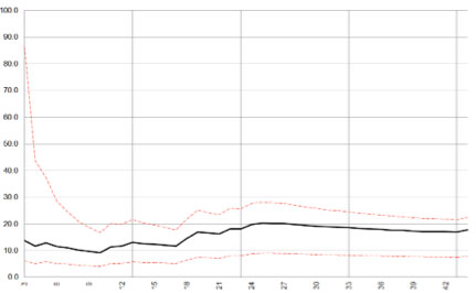
Nothing too exciting here, as we see the data stabilize less quickly than year two, but quicker than the post-election first year chart and about on par with the third year chart.
Final Confirmation Chart
Remember from last week’s newsletter that the presidential cycle debunking article made a reasonably valid claim that Hirsch’s pre-1900 stock data was suspect since there were no standard indexes to draw from. So what if we looked at only the post-1900 data? Would the data still show stabilization and pass the visual test? To check, let’s just use data from the least stable data in year one in the cycle. This would be the toughest test of the four years:
It certainly looks like the visual method confirms what the peer reviewed papers found- that there is in fact statistically validity to the smaller data set.
A Word of Caution
Remember that statistically validated seasonal patterns do not give us certainty. Rather, they give us an edge to push our expectation in a particular direction.
I hope that this unique visual way of looking at sample size implications has been as enlightening for you as it was for me!
If you’ve found this article useful or thought provoking (or both), I’d love to hear your thoughts and feedback – just send an email to drbarton “at” vantharp.com.
Great Trading,
D. R.