
There are numerous ETFs that track everything from countries, commodities, currencies and stock market indices to individual market sectors. ETFs provide a wonderfully easy way to discover what’s happening in the world markets. I apply a version of my System Quality Number® (SQN®) score to measure the relative performance of numerous markets in a world model.
The Market SQN score uses the daily percent change for input over a 100-day period. Typically, a Market SQN score over 1.47 is strongly bullish and a score below -0.7 is very weak. The following color codes help communicate the strengths and weaknesses of the ETFs in this report:
- Dark Green: ETFs with very strong Market SQN scores > 1.47
- Light Green: ETFs with strong Market SQN scores (0.70 to 1.47).
- Yellow: ETFs with slightly positive Market SQN scores (0 to 0.70). These are Neutral/Sideways
- Brown: ETFs with slightly negative Market SQN scores (0 to -0.7).
- Red: Very weak ETFs that earn negative Market SQN scores (< -0.7).
This is basically the same rating scale that we use for the Market SQN Score in the Market Update. The world market model spreadsheet report below contains a cross section of currently available ETFs; excluding inverse funds and leveraged funds. In short, it covers equity markets around the globe, major asset classes, equity market segments, industrial sectors, and major currencies.
World Market Summary — Equities & Currencies
Each month we look at the equities markets across the globe by segment, region, and sector. The US Dollar continued to be strong through December but it is no longer green as it has been for a long time. Since everything in the database is priced in the US Dollar, foreign assets seem weaker — and that’s the way the entire chart looks. Asia, Europe, and the rest of the Americas look pretty weak, however, even US market segments are now looking weak.
In equities, we only have one green market sector (Volatility), two yellow sectors (Utilities), and one country (Brazil). Every other country, segment, and sector is red or brown. In fact there isn’t much brown. In Asia, Hong Kong, Korea, India, and Thailand are brown but everything else in Asia is red.
In Europe there are two brown sectors — Russia and Poland. The rest are red.
In the US market segments and in the Americas, Brazil is the only yellow ETF. The Dow 30 and Latin American are brown. Everything else is red.
And there is not much to report about individual sectors because except for those already mentioned, they are all red.
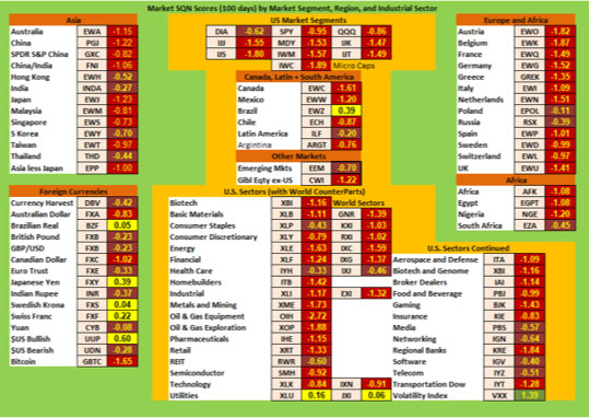
urrencies are a bit different with more of a range of performance. The US dollar is the strongest yellow currency based ETF, followed by the Japanese Yen, the Swiss Franc, the Brazilian Real, and the Swedish Krona. The Australian Dollar, the Canadian Dollar, and Bitcoin are red this month. Every other currency is brown.
In the US Market sectors, we find that Utilities are the only yellow symbol, while Consumer Staples, REITs, Media, Networking, Software and Telecom are brown. Everything else is red. The Volatility Index ETF is the only green ETF in the table.
Commodities, Real Estate, Debt, and the Top and Bottom Lists
Commodities were still weak overall in December but Gold and Livestock have turned light green. Silver and Natural Gas are yellow with everything else being brown or red.
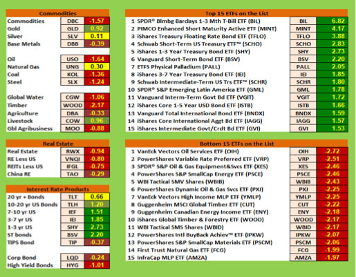
Real estate across the board looks weak with everything being red except for China which is brown. All the interest rates products look pretty good. Junk is the only red bond ETF, corporate and TIPS bonds are brown and long term treasuries are yellow. Mid-term treasuries are light green with the rest of the bond symbols being dark green.
The top 15 list last month had one dark green (Natural Gas) with everything else being light green. This month, everything is dark green and mostly oriented to shorter term debt symbols. All 15 of the worst performing funds are red, have a lot of energy related issues, and 13 of the 15 bottom ETFs are weaker than a minus 2.0.
Summary
Let’s look at the summary table which measures the percentage of ETFs in each of the strength categories. You can see the distribution of the database by Market SQN score in bullish, neutral and bearish categories below —
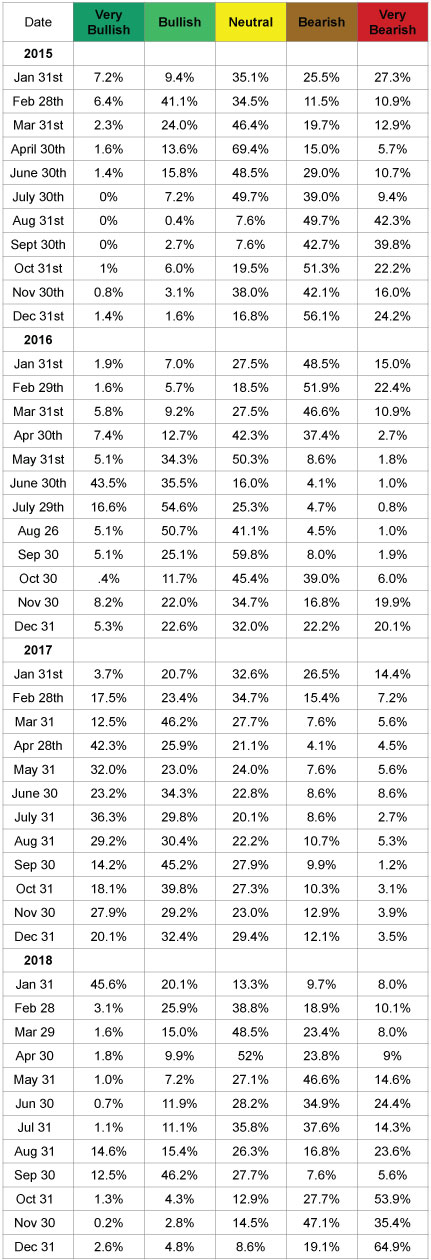
The market became quite weak in October with 7.5% of all sectors being bullish and 84% being bearish. On Nov 30th, only 3% of the symbols in the database were bullish while 82.5% were bearish. At the end of December, 84% of the database was in bearish territory with 65% in very bearish territory. We have been keeping up with this data since the beginning of 2015 and the last two months were by far the most bearish months in that four-year period. Market pundits say that 2018 was the worst year since 2008.
I have no idea whether this market will stay where it is now and become sideways or if it will get worse or if it will recover. Just watch what the market is doing and pay attention to that.
Be careful to base your actions upon what IS happening, not what you think might happen. The markets always offer opportunities, but to capture those opportunities, you MUST know what you are doing. If you want to trade these markets, you need to approach them as a trader, not a long-term investor. We’d like to help you learn how to trade professionally because trying to navigate the markets without an education is hazardous to your wealth. All the beliefs given in this update are my own. Though I find them useful, you may not. You can only trade your own beliefs about the markets.
Until next month this is Van Tharp.