Tharp's Thoughts Weekly Newsletter (View On-Line)
-
Article A Primer On Adusted Data For Equities by Thomas Krawinkel
-
-
TradingTip Risk-On & Risk-Off Trading—The New Normal, Pt. 3 by D.R. Barton, Jr.
Ken Long will be back in July and August to teach more trading systems.
The August workshop is new!
Click Here to Learn More About The Workshops.
 Know Your Data: A Primer On Adjusted Data For Equities Know Your Data: A Primer On Adjusted Data For Equities
by Thomas Krawinkel
As you probably know, technical analysis is always based on historical quotes, whether you’re simply looking at a chart or conducting complicated backtests. What you may not know is that some of this data has been altered and therefore may not reflect the reality that existed at the times represented by each data point. What are the consequences of these changes for your individual trading approach?
To get us started, let’s take a look at IVR, which made a nice consolidation before it broke out beyond a prior local double top:
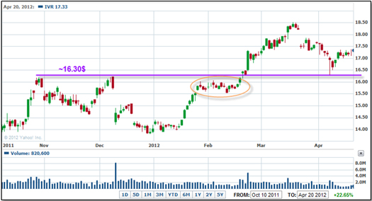
Figure 1: IVR consolidates prior to breakout (source: Yahoo.com)
View Larger Image
Or did it consolidate after the breakout to gather steam for the subsequent rise?
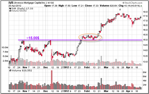
Figure 2: IVR consolidates after breakout (source: StockCharts.com)
View Larger Image
Same issue, same dates, but different prices? What’s going on here? The answer is that two chart providers (Yahoo for Figure 1 and StockCharts for Figure 2) have two different approaches when it comes to adjusting historical data. As we can see from the IVR chart from Google, a dividend payment between the double top and the consolidation causes the difference between Yahoo’s prices and Stockcharts’ prices:
Figure 3: Dividend payment by IVR (source: Google.com)
View Larger Image
I think this example demonstrates pretty well why paying attention to data and possible alterations is so important.
In this article, I will focus on equities, primarily because they have several unique aspects that other assets do not have. The main reasons for equity price adjustments are:
- Dividend payments
- Splits
- Special payments in cash or shares (this is rather rare)
When any of these incidents occurs for any instrument, the exchange can see a (sometimes drastic) change in the trading price, which can make altering all data prior to the event in an appropriate manner useful. The goal behind any adjustment is to make the data before and after the event more comparable.
In the case of a dividend payment, prior prices are reduced, as though the payment occurred even earlier. Pushing it back in time moves the impact it had on price further into the past until it is no longer relevant to the chart or whatever analysis the data is used for. Data vendors apply a similar logic after splits, where the adjustment gives the appearance that the split happened earlier. Typically, only the historical price values are changed, but especially in the case of splits, it may be useful to adjust the volume as well.
Basically, there are three calculation methods that can adjust price for dividends and splits.
- Offset method (price): Subtraction of payments from prior prices
Logic for dividends:
pricen ≈ pricen+1 + div.
pricen – div. ≈ –pricen+1
=> Subtract dividend amount from all prior prices
Note: the character “≈” is used to indicate that two values are considered comparable.
- Proportional method (price): Multiplication with a factor (based on split ratio or paid amount in relation to CLOSE on day prior to payment)
Logic for dividends:
pricen ≈ pricen+1 + div.
pricen – div. ≈ pricen+1
pricen * (1 – div./pricen) ≈ pricen+1
=> Multiply all prior prices with (1 – div./pricen)
Logic for splits:
pricen ≈ pricen+1 * fsplit (i.e., 3 shares for 2 => fsplit: 3/2 = 1.5)
pricen* 1/fsplit ≈ pricen+1
=> Multiply all prior prices with 1/fsplit
- Proportional method (volume): multiplication with the inverse (1/x) of the factor that was used on price so that the product of price and volume is identical before and after the adjustment (pt * volumet = constant).
Dividends: multiply all prior prices with 1/(1 – div./pricen)
Splits: multiply all prior prices with fsplit
The differences in our example charts stem from the fact that StockCharts applied a proportional change prior to the dividend, while Yahoo and Google didn’t adjust for it at all.
By now, you may be confused. You may wonder why there are several ways of representing history, and which one is correct. The answer is: It depends on the purpose for which you’re using the data and the beliefs you hold regarding its influence (or lack thereof) on your trading approach. Since there is no absolute right or wrong answer here, I will give my personal opinion as a starting point so you can make your own assessment. Here’s my evaluation of the different methods:
No adjustments:
- Benefit: Raw data is best for simulating trades in backtests.
- Drawback: Any dividends, splits, etc. that happen during a simulated trade must be taken care of separately by the simulation software that would need this information as separate input.
- Drawback: Unadjusted price changes will distort many indicators (i.e., RSI, moving averages, ATR, etc.) and may cause them to become useless for a period of time (see example below).
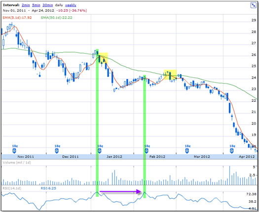
Figure 4: Indicators for ERF without data adjustments (source: Google.com)
View Larger Image
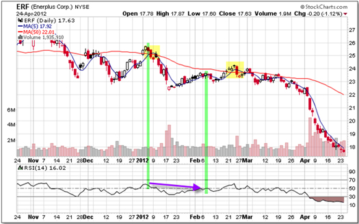
Figure 5: Indicators for ERF with proportional data adjustments (source: StockCharts.com)
View Larger Image
Split adjustments only (proportional method):
- Benefit: Good for chart-formation-based trading (i.e., breakout from double top as in Figure 1) if you believe that market participants don’t care about the dividends (in Figure 1, paid after or between the tops).
- Drawback: Dividends (& special events) will distort many indicators.
- Drawback: For backtesting, the simulation software needs to account for missing adjustments.
- Drawback: For backtesting, the adjusted prices lead to a different number of shares (base for commissions) and rounding errors.
- Drawback: For backtesting, the simulation may not use absolute price differences for entry/exit/stops (i.e., entry 5 cents above prior day’s high, stop 10 cents below last local low, etc.).
Split & dividend & special payment adjustments (proportional method):
- Benefit: Useful whenever a correct value development (of equity, portfolio, pair relation, etc.) is required.
- Benefit: No distortion of indicators.
- Drawback: Only useful for chart-pattern-based systems (with daily and longer time intervals) if your belief is that the market participants take the dividends and special payments into consideration (as in Figure 2).
- Drawback: Adjusted prices are least useful for simulating trades.
Special payment adjustments (offset method):
- Benefit: No distortion of indicators.
- Drawback: Only useful for chart-pattern-based systems (with daily and longer time intervals), if your belief is that the market participants take the dividends and special payments into consideration.
- Drawback: Adjusted prices are least useful for simulating trades.
- Drawback: Offset adjustment method can lead to a price of zero or a negative value (see below).
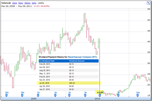
Figure 6: Special dividend by WY without data adjustments (source: Google.com)
View Larger Image
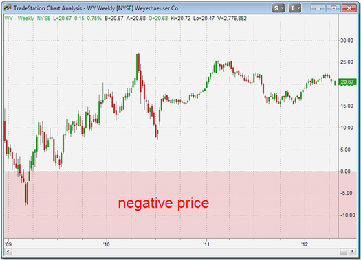
Figure 7: Special dividend by WY with offset adjustments (source: TradeStation)
View Larger Image
Volume adjustments (proportional method):
- Benefit: Proportional adjustment for splits may be useful depending on the way volume is used because it eliminates the jump/drop caused by the event for which it's adjusted.
- Drawback: Typically not done by data provider and therefore needs to be taken care of by trader.
- Drawback: No adjustment due to dividends recommended, but might be automatically applied by software or data provider.
Dealing with data and the calculation processes it goes through might not appeal to many traders, but data is the foundation upon which we base our trading decisions. It’s like being able to understand a map: there are several types, all for various purposes. Not knowing about map types and not understanding their best uses can get you lost. The same is true of adjustment methods. You have to understand when and how to apply each method, or else you’ll misinterpret what you believe you see.
Finally, as you pay close attention to the input that informs your decision-making processes, you are more likely to discover actual errors in the data. Sooner or later, any source will give you false information, no matter how expensive or careful it is. Just being aware of this problem and giving a little attention to this topic can help you prevent serious damage to your account. As a bonus, I put together a collection of some data oddities I’ve discovered that illustrate this point (click here).
About the Author: With a focus on mechanical and fully-automated systems, Thomas Krawinkel embarked on his journey to turn a passion for trading into a sustainable profession in 2010. He discovered a love of writing and the benefits of putting thoughts on paper when he composed his submission for NAAIM’s 2011 Wagner Award, for which he won first place. He hopes to spark discussions by writing articles for VTI’s newsletter and welcomes any feedback as a further learning opportunity. You can reach him at "tkrawinkel" at "gmx.de".
Disclaimer
Trading Education
Workshops
Would you like to learn a longer-term system? Check out July.
Would you like to learn a new intraday system? Check out August.
July
21-22 |
$2,295
$2,995
|
Core Trading Systems: Market Outperformance and Absolute Returns
-
Are you more of an investor than a trader but want to manage your funds a bit more actively?
-
Do you have very little time to trade?
-
Does your retirement plan offer only limited choices on where you can put your money?
-
Are you a short-term trader who wants to put some of your equity to work in intermediate and longer-term systems?
Learn profitable longer-term systems that take very little of your time to trade.
|
Cary, NC |
August
3-5 |
$3,295
$3,995
|
Frog Trading System Boot Camp
A simple-yet-profitable system with no overnight risk and daily opportunities.
Presented by Ken Long |
Cary, NC |
August
24-30 |
$5,090
(combo) |
Peak 101 and Peak 203 (AKA, The Happiness Workshop) |
Cary, NC |
| Sept 21-28 |
Varies |
Mechanical Systems for Day and Swing, and Discretionary Live Trading
Presented by Ken Long |
Cary, NC |
| October 19-21 |
$2,295
$2,995
|
Peak Performance 101
Van Tharp's Signature Workshop |
Cary, NC |
| October 23-26 |
$3,295
$3,995
|
Peak Performance 202
with Van Tharp and Dr. Libby Adams |
Cary, NC |
To see our full workshop schedule, including dates, prices and location, click here.
Trading Tip 
Risk-On & Risk-Off Trading—The New Normal
Part 3
by D.R. Barton, Jr.
For the past few weeks, we’ve been looking at the “risk on, risk off” (RORO) description of broad market behavior. This phenomenon has either been a driver or a descriptor of the vastly increased correlation between equities markets and even between equities and other asset classes.
In Part 2 (click here to view), we reviewed the descriptive thoughts of the ever-astute Jeremy Grantham of GMO on what’s behind RORO. This week, I thought we’d do something for the visually oriented folks out there.
As long-time readers will know, I have a real appreciation for visuals that tell a story well. In my research, I’ve found some really interesting work by banking and financial services behemoth HSBC, which puts out periodic reports that show their own RORO analysis. Most interesting to me is their asset class correlation heat map.
Today, let’s take a look at what this intriguing tool showed for three different periods and see what conclusions we might draw.
Correlation Heat Maps: Quantitative Proof RORO is Real
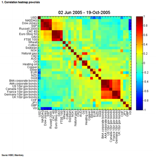
First, we’ll look at a few correlation heat maps from the 2005-2006 timeframe—before the real estate bubble. The graphic below shows the correlation between 35 asset classes. After the graphic, I’ll describe some of the details:
View Larger Image
This chart obviously requires some explanation. From top to bottom along the y-axis are equity markets, commodities, currencies, energy, bonds and the true “risk off” items like the Japanese Yen and VIX. The order is the same from left to right along the x axis. Given the layout of the map, the 45-degree diagonal line of dark red boxes represents each asset class compared to itself—total correlation. Highly correlated asset classes show up as red, somewhat correlated asset classes show up as various shades of yellow and green, and complete inverse correlations show up as dark blue.
Back in 2005-2006, equity markets across regions had mild correlation and various bond groups had fairly strong correlations with one another. That gives us a baseline. Other than bonds and the equity markets, we see relatively little correlation and relatively little inverse correlation among the asset classes.
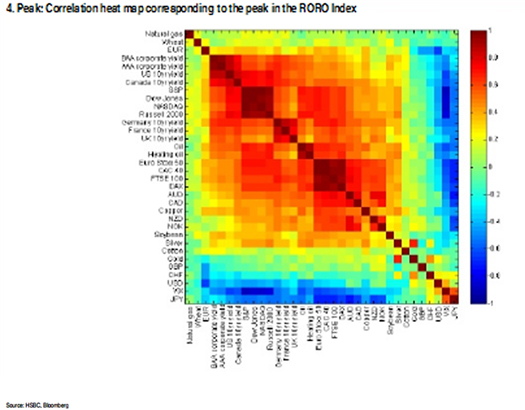
Now, let’s fast-forward to the height of the financial crisis and look at the peak correlation in late 2008:
View Larger Image
In this version of the graph, the HSBC analysts ordered the assets a little differently. They have a tendency to vary the order in their different research reports. The message, however, is loud and clear. At the worst point of the financial crisis, we see a massive expansion of positive correlations (yellows, oranges and reds) across almost all assets classes. Notice, too, that the amount of area for inversely correlated assets (blues) is much bigger than during pre-crisis times.
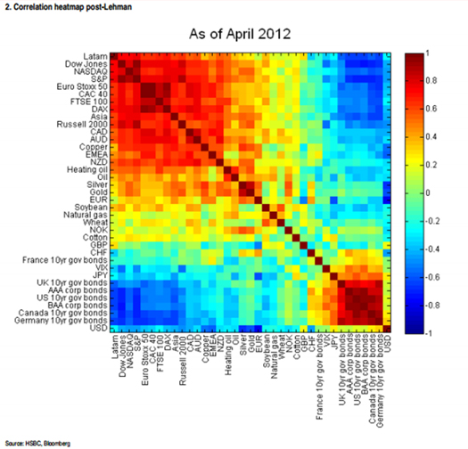
Lastly, let’s take a look at the HSBC heat map from their May 2012 report:
View Larger Image
While not as drastic as during the height of the financial crisis, it still looks more like the “crisis mode” heat map of 2008 than the one from 2005-2006.
Take-Aways?
What can we take away from all of this? RORO trading has given us some interesting market behavior patterns—long, smooth upward pushes punctuated by violent pullbacks.
Next week, we’ll dig more into what individual traders and investors can do to respect and prepare for more of the risk-on, risk-off market movement paradigm. Until then…
Great Trading, D. R.
About the Author: A passion for the systematic approach to the markets and lifelong love of teaching and learning have propelled D.R. Barton, Jr. to the top of the investment and trading arena. He is a regularly featured guest on both Report on Business TV, and WTOP News Radio in Washington, D.C., and has been a guest on Bloomberg Radio. His articles have appeared on SmartMoney.com and Financial Advisor magazine. You may contact D.R. at "drbarton" at "vantharp.com".
Disclaimer

Peak Performance Home Study Program for Traders and Investors
Are you interested in learning how to make extra profits from the market over the next year or two?
With this home study course, you’re going to learn to do exactly that with your trading—regardless of any limits you may have put on your time—by discovering the simple "edge" you need for super success in the markets today.
Once you master key trading principles often overlooked by even the most experienced investors and traders, you’ll finally understand and possess the same money-making and cash-flow secrets that have catapulted certain astute traders to superstar wealth and success status. You’ll understand why they continue to make money while everyone else is losing their shirts.
Learn More
Buy Now
"I would recommend the new Peak Performance Course to anyone who wants to excel in their trading. In fact, I would recommend that no one actively trade until they have gone through this material several times and understand it completely. The new version is excellent, and I found the new chapters on personal responsibility and changing your beliefs to be the most valuable. This course forces you to do the self-work that is critical to successful trading and improving all aspects of your life!"—a happy customer
Ask Van...
Everything we do here at the Van Tharp Institute is focused on helping you improve as a trader and investor. Consequently, we love to get your feedback, both positive and negative!
Click here to take our quick, 6-question survey.
Also, send comments or ask Van a question by using the form below.
Click Here for Feedback Form »
Back to Top
Contact Us
Email us at [email protected]
The Van Tharp Institute does not support spamming in any way, shape or form. This is a subscription based newsletter.
To change your e-mail Address, click here
To stop your subscription, click on the "unsubscribe" link at the bottom left-hand corner of this email.
How are we doing? Give us your feedback! Click here to take our quick survey.
800-385-4486 * 919-466-0043 * Fax 919-466-0408
SQN® and the System Quality Number® are registered trademarks of the Van Tharp Institute
Back to Top |